When we were creating our media product, branding was a factor we took very much into consideration. This was because we wanted to make sure that throughout our work, that there was a present main theme and branding.
To make the products successful, is to make sure that the product you have created needs to be significant in one or many ways. This is because if the product is significant then its more than likely will become remembered and with competitors on the market, is a perk that makes you stand above them. An iconic image in a film is the significant image in a film that people remember, if an iconic image is done correctly, the film can have any iconic image such as a prop, a item of clothing, a setting, or a logo.
To make the products successful, is to make sure that the product you have created needs to be significant in one or many ways. This is because if the product is significant then its more than likely will become remembered and with competitors on the market, is a perk that makes you stand above them. An iconic image in a film is the significant image in a film that people remember, if an iconic image is done correctly, the film can have any iconic image such as a prop, a item of clothing, a setting, or a logo.
Iconic Image |
|
Scream

One of the most famous examples set by a movie for an iconic image would be the film "Scream". Scream was released in 1996, and presented film watchers with a new iconic image not seen before, which was the "Mask". It was so iconic that a person could see the mask and instantly associate it with the film scream. One of the benefits to using an iconic image in our trailer was the fact that like scream it could be easily remembered, so can be rewatched.
Iconic Texts |
|
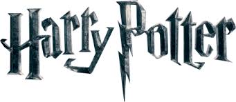
Harry Potter
|
The harry potter font is iconic in many ways, not only does it represent the film through the font. The name of the main character is also the font title and the title that the font is used for, meaning that the font is link to an important character, showing the audience that it is unique and important.
|
|
Star wars

|
When a film becomes successful, its more than likely going to be remember and gather a fanbase, This is the same case for Star Wars. Due to success of the film has meant that merchandise has been distributed for fans, the font in which the Star Wars franchise can be associated with has become iconic that you can identify a product to do with star wars because of the font. Due to the simplicity of the Font meant that it has become unique and not over complicated, which is what we based our Font choice on. Simple yet easy to remember.
|
ICONIC POSTERS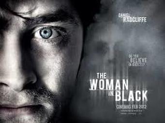
|
A good example of an iconic movie poster is the Poster from "The woman in Black". The iconic image on this poster is the actor Daniel Radcliffes face. The close up on his face can show the audience that this is the main character or possible a character that has significant importance.. The dull expressions presented by the actor, with the pale face combine to make a scared feeling to the poster. As you can see in the back of the poster there is a blurred out fac. This is meant to not be clear to make the audience wonder as well as a fear aspect to the film.
|
|
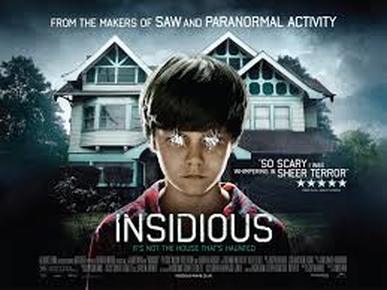
Another good example of a movie poster that has iconic images is the Insidious poster. The iconic aspect to this poster is the fact that it cannot be related to another horror film. The poster itself contains a young possessed boy that has a particularly unusual house in the background. The poster works well as the tagline "Its not the house thats haunted" works in combination with boy in the picture as well as the horror house in the background. It not only highlights the boy being the main antagonist, but gives the audience the plot of the film if they hadn't seen any other form of information about the film. The font within the poster is a simple yet easy to remember font, this is a common trend with most movie posters as they dont take the "light" away from the images behind. This is what we upheld when creating our poster, simple font that not only compliments the background but doesn't take the fame from the images behind.
|
|
Iconic Magazines
|
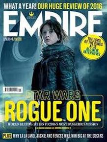
As far as film magazines are concern there are several famous examples of magazines. Empire is one of these. Empire is a well known magazine that currently post different stories about films , film reviews, and whats coming up in the film market. In this particular magazine they are reviewing the STAR WARS rouge one film. The main character on the front is kept simple but it highlight the directness to the film, and highlights she's the main focus. The way in which this works is the faded death star in the background , and the character that fades over the Empire title really shows she's the main focus. The magazine has directly used the colour of the font for "STAR WARS" to bring a bit of continuity and too tie it to the film. This makes an effective magazine cover.
|
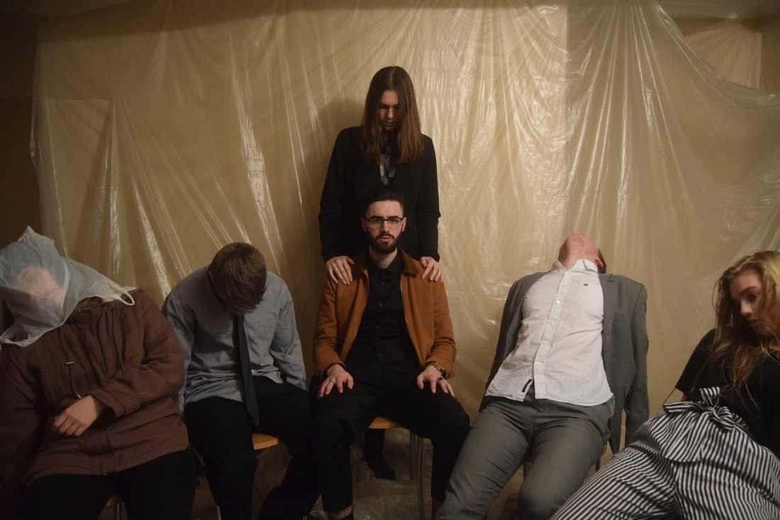
necessary choice of location for our poster was chosen due to the significance that the location has on the trailer. The Apartement area which is the background for the poster, is often seen as the killers base of operations in our trailer , so we chose it due to it being relevant. We chose the this specific photo which was also in our trailer due to the the fact that, the killer is shown to be with the rest of the dead, which a figure behind ,showing a higher power and that the killer is theoretically on the same level as the dead.
When we shot the scene where we go the photo from, we wanted an erie setting that would match with the continuity of the trailer, but a erie gloomy scene that could also have been easily edited and allow for further changes if necessary. Unlike a typical poster, we decided to make our poster landscape instead of portrait, this meant we could get more of the people and the background in, whilst not covering too much of the focus with the title and other text. |
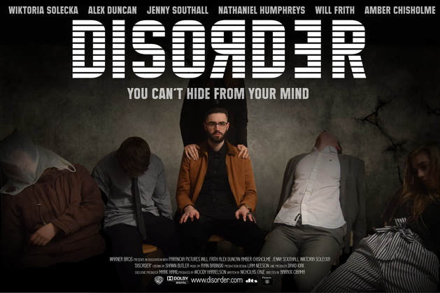
For our final design on the poster, as a group we wanted to keep things simple, from things such as the title and the background. If the poster is simple then the people who happen to see the poster before the trailer then it wouldn't confuse the plot.
However contradictory compared to most poster who dont give away much of the plot , our poster is sort of different, as it doesn't necessarily give away the plot, but the scene that is the photo is in the trailer. This not only isn't a bad thing but can be seen as good continuity and shows that the film locations are significant and the scenes work to overview the film. For the title in the poster, we used the same font as used in the trailer, meaning that the iconic font can be linked between both the film and the poster. The poster would not look as professional if we had used another font, this way you understand that the film is linked to the poster and the experience feels better. We decided to darken the background allowing for the white title to standout more, and highlight the tile of the film and its importance. The background was darkened and change and the characters to the side of the main character was darken to highlight "Nathan" our main villain but also not so dark as to not see the importance of the location with the dead. We have used the title to mask the other teased villain character, this way it leaves the audience wondering who and what the character is, leaving the mystery to the film. |
