Magazine ANALYSIS
Magazines are very important as they inform the public of what films are on and are popular. This means magazines are one of the main mediums to try and sell certain films. Therefore, the cover has to be eye-catching, powerful and prove that the film they are advertising is good. To make the magazine cover have a large impact they have to include a large amount of editing within the text and the image they are using for the film and what they are trying to prevail. Therefore, the image has to be eye catching and can be used in creative ways such as in front or behind the titles.
|
Total FilmThe Magazine titled Total Film is a UK-based film magazine first launched in February 1997. The magazine is currently edited by Jane Crowther and is issued monthly and offers cinema, DVD and Blu-ray news, reviews and features. They publish their magazine every year since issue 91, 2004 which is published between July and August issue.
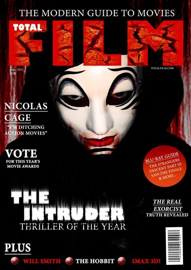
The main character on this magazine is the Intruder from the film "The Intruder". This menacing character is the main focus on the front cover which shows immediately the face of the film in focus. Furthermore, the manner in which she is looking at the camera allows for the audience to perceive the character as threatening. This is supported by the font which is red as it stands out. Moreover, the title has a picture of a ground undergoing a drought as it's cracked up. At the bottom of the magazine they have other items that the magazine contains. On this magazine cover the Intruder is shown in a staged shot where the actor is in costume and is photographed for the cover. EmpireEmpire is a British film magazine published monthly by Bauer Consumer Media of Hamburg. The first issue was published in July 1989 by Barry Mclheney and was published by Emap. Bauer then purchased Emap Consumer Media in early 2008. Empire then became the biggest selling magazine in the UK and was also published in the USA, Australia, Turkey, Russia, Italy and Portugal.
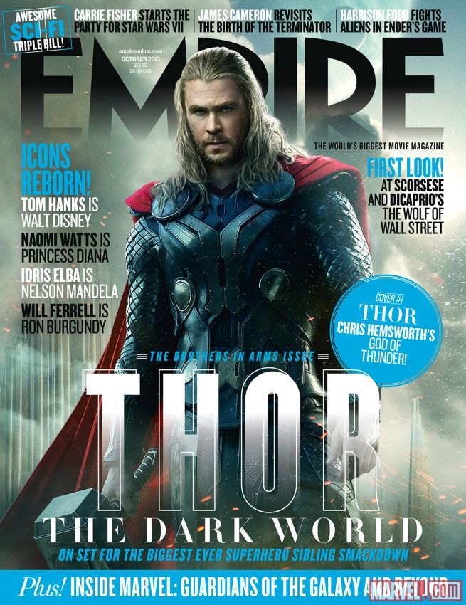
This magazine was created and published for the release of Thor The Dark World. This placed Thor as the main focus of the cover with the use of blue, black and silver which separates the cover from Thor as he's wearing a red cloak. However, it still corresponds with the rest of his outfit. The Empire title itself is revealed as mysterious and as it's clouded slightly. This helps fit the theme as the background is also shrouded slightly. This magazine cover for Thor: The Dark World uses a action shot which is taken from the movie. PremierePremiere was an American Magazine which was discontinued in 2007 when they published their first issue. The magazine was founded in 1978 by Hachette Filipacchi Media U.S. However, the original version of the magazine, première, was established in France in 1976 and is still published there.
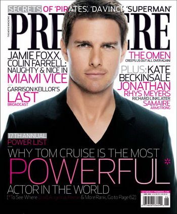
The focus of this magazine is similar to the other magazines however, this magazine has less background and more foreground which puts more focus onto the main actor. Furthermore, the title is placed behind his head to emphasise the magazines main focus. The use of pink and larger fonts means it appeals to more than just the film market. This uses an actor shot as it's just of Tom Cruise in a pose which isn't taken from the film. Entertainment weeklyEntertainment weekly is an American Magazine published by Time inc. The first issue was published on February 16, 1990. This issue was created by Jeff Jarvis and founded by Michael Klingensmith, who worked as a publisher until October 1996.
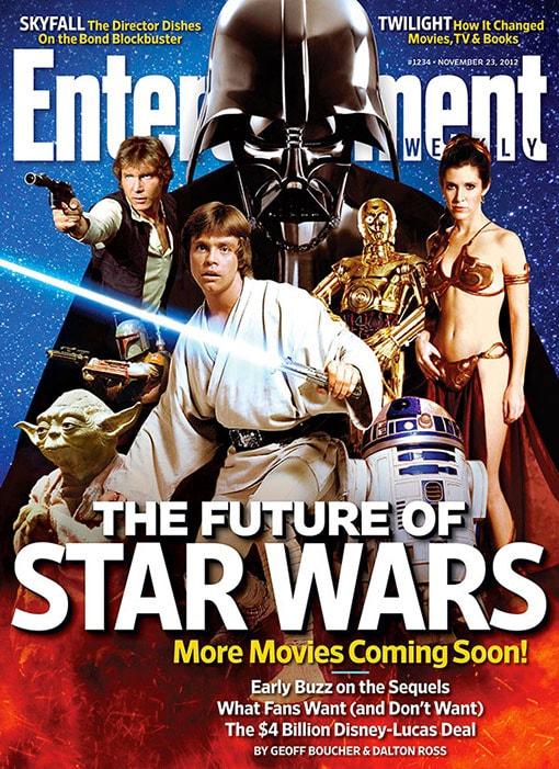
This magazine cover shows the entire cast placed in front of the Entertainment Weekly title. Furthermore, this the nemesis of the series or main antagonist is placed at the back with a larger figure than the rest of the characters which portrays his dominance. This also puts a well known face on the front cover which attracts more people to their magazine. The font and focus of the magazine is also placed near the bottom of the magazine to show what the article is about and their subcategories beneath that. This magazine uses a Character shot as it shows all the main characters together. |
DISORDER FILM POSTER
For our magazine cover we chose to go with an ominous setting with Nathan (Our Antagonist) being the main focus of our cover. The hands on his shoulders are that of the apparition. This shows the control over Nathan. We used the magazine cover from the film "The Intruder" because it shows the antagonist's face which can reveal a lot about a person. Furthermore, the use of the shadows and the black surrounding suggests they are the main focus of the film. This is known as a staged shot. Moreover, this also leaves an ominous setting to the film as his face and the hands are the only visible. Through analysing the other magazine covers we determined that the title of the magazine (Masthead) and of the film (Main Cover Title) had to be the two most prominent aspects behind the image. This is shown by making the text of our film the second largest piece of text on our cover. The theme of the cover consists of three different colours which uses effectiveness through simplicity. These colours and the background being black allows for consistency within the film and the way it advertises.
concept images:
final product:

|
