In What Way Does Your Media Product Use, Develop Or Challenge Norms And Conventions Of Real Media Products?
TRAILER
Using conventions
Developing conventions
Challenging conventions
- We used low key lighting in the majority of our shots, especially later in the trailer where the victims are being stalked and killed. Our titles were also featured on dark backgrounds, giving them more of a sinister impact and keeping the mood of the trailer constant. Several scenes were filmed during daylight hours, so had natural lighting, and we decided to make them darker in post production using the cool tones effect. For this convention, we looked at 'The Conjuring' and 'The Suffering' which primarily feature low key lighting with a few daylight shots dispersed in the trailers.
- Our trailer strongly relates to Wheeler Winston Dixon's theory of 'sites of activity'. There is no character development or speaking from the victims or any representation that they might have a role to play in the film. Therefore, as Dixon states, they are in the trailer to be 'sites of activity' and are seen purely to aid the portrayal of the killer.
Developing conventions
- We took inspiration from 'Split' for the genre of our trailer which clearly shows the identity of the killer but because of the psychological aspect, revealing the identity did not raise any concerns about spoiling the plot of the film. We knew that this wouldn't be a problem by seeing how Split portrayed their main character. Whereas 'Split' has an antagonist with multiple personalities, we developed this idea for our own killer who has a dangerous and murderous side to him that has taken form of a manifestation in his mind.
- Most of our killing scenes are filmed in what would be considered a safe environment such as the home of the victims. We developed Wes Craven's theory by which a stereotypical safe place is used, as seen in 'A Nightmare in Elm street' where a murder takes place in a police station.
Challenging conventions
- We did decide on using high key lighting for the first scene where we are introduced to Nathan at the park and the first victim played by Will walks past on his phone. The unconventional use of a well lit area is later contrasted with the stalking and killing scenes after Nathan's murderous intentions are known to the audience.
- We decided to use multiple victims in our trailer, focusing on each individual death in order to build up towards the final shot. The focus was the killer more than anything and his story and perspective would be the focal point if we were to make the full length film. Nathan was our main character and even though Jenny's character has a key role in the plot of the film, we didn't want to show too much of her character, giving her an ominous appearance that would later develop in the film.
- Challenging Kaminski's theory, our killer does not use a conventional weapon as an extension of his identity. His mental state is the focal point of the trailer, made clear by the presence of the manifestation seen watching over him. He does use different items to aid his kills such as a plastic bag or rope but these are not used repeatedly or to represent the killer.
MAGAZINE COVER
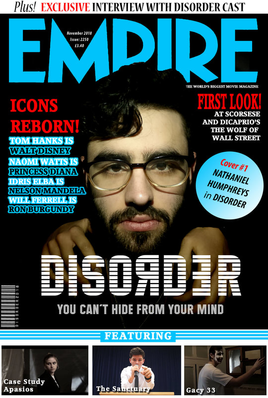
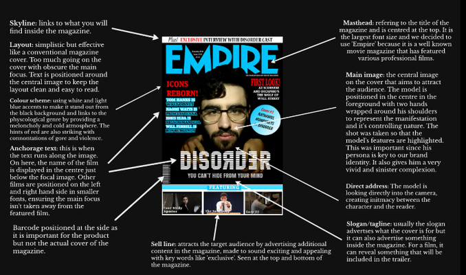
For our magazine cover we kept to using cool colours for the text, sticking with white to stand out from the background just like we did with our trailer titles. We also made sure the text for the trailer title was the same in our trailer and poster since this is part of the brand's identity and follows your conventional horror magazine cover. However we challenged the conventional horror magazine cover by not having red text as our main theme, alerting to danger. Instead the blue creates a more cynical and melancholy feel to the magazine cover, effectively portraying the genre and making our cover stand out from others.
Like in many horror magazine covers, using red as their accent represents the blood and horror that would normally feature in. We used white and grey for the the rest of the text because we wanted them to stand out from the background. We kept to the convention that typically movie magazine covers use white text as it gives it a clear and professional appearance. The image we decided to take conforms to the convention because the majority of magazine covers use black as an undertone for their images, and it was in stark contrast to the colour text we used.
We decided to take the image for the cover in a darkened room as within the trailer there were repeated scenes of our killer remaining in a single room that we later adapted for the film poster. We conformed to the convention that magazine covers normally only feature the characters and not the setting as featured in the movie. The location was never the focus in the film so we wanted to emphasise what was important to the film such as Nathan's character and the manifestation. We represented the manifestation with their hands, showing how they control Nathan's character. Like in the trailer, we did not what to give away the full appearance of the manifestation as this wouldn't build anticipation from our audience before seeing the full length feature film. We also didn't require to feature a location for context reasons because Nathan's persona links perfectly with the images in the trailer and on our poster. We used a close up image of Nathan's face for the purpose of attracting people into buying the magazine. This is following convention because companies will take a higher quality image for their magazine covers to make the magazine more appealing to buyers. They rarely feature a shot from the movie itself.
We had one person as the main focus on the cover and that was our killer played by Nathan. We made this decision since Nathan's face is featured multiple times in the trailer and became our brand identity. We also however had the hands on the manifestation, and the way they are positioned around Nathan's neck suggest the power they have over him. It also suggests a puppet-puppeteer relationship between these two characters. In this way, by having two people on the cover we challenge the convention that normally only one person features on the cover.
We positioned the main title of the magazine at the top of the cover since it is the key focus on the page, aside from the image, and follows the conventional magazine cover where main titles are situated at the top. This allows customers to identify the magazine easily. We placed our model in the foreground so it isn't hidden by the text, something that is seen on most professional magazine covers. We positioned the words around Nathan and the hands so as not to overlap. This is a developing convention because although most magazine editors will position the text around the edge of the cover, they will normally position the main titles around the edge as well and we decided to put the title of our movie at the bottom which works best with the image.
We included a word bubble and text relevant to other films to ensure our magazine cover looked like a genuine magazine. At the bottom of the cover and on both the left and right hand sides we have included advertising for some other movies, following a conventional magazine cover because they all feature advertising for films not necessarily featured on the cover.
We decided to use the fonts featured on a conventional magazine cover such as the 'Empire' logo since this is the company's identity and as it already linked with our colour scheme we didn't need to change it. The title of the magazine is larger than the rest of the text, with our movie title being only slightly smaller. We followed convention with the size of the text since otherwise the professional layout of the magazine wouldn't be possible but we also developed this convention by positioning the text differently to a classic magazine cover.
To see inspiration for our magazine cover and the types of covers we chose from click here.
Access link copy: https://prezi.com/view/fiY2uRfJgD4uguapvX7t/
poster
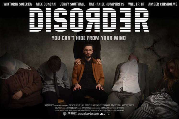
During the making of our poster, we continued using a dark colour scheme to make the poster more sinister, playing on people's fears of something lurking in the darkness. A lighter colour scheme would give it a more sterile or laboratory look which is effective in trailers that link to such themes like the 'Saw' where the white wash posters and body parts tie in with the gruesome trials the victims face. For our poster, we developed the convention as colour schemes on recent horror movie posters are generally both black and white as seen on posters for 'The Cabin in the Woods,' 'The Conjuring' and 'Sinister'. These posters both have contrasting dark backgrounds with a much lighter colour scheme within the posters, providing contrast and hence a more dramatic appeal. I believe the darker colours we used for our poster link well with the plot of our film and represents the genre appropriately. We decided to keep the text a single colour, challenging the convention where horror posters usually have some form of red to represent blood and gore within the movie. However, we don't have gore in our trailer due to the psychological nature of the film and the way our killer dispatches his victims so using red text wouldn't fit with our theme.
For the image on our poster, we used a still shot of our killer surrounded by his victims. The main focus is still the killer and moreover the figure standing behind him which ties perfectly with the magazine cover as well as representing the trailer well. We made sure the killer was the one in focus by editing the image to be lighter in the centre where he is positioned and the victims on each side of him feature in low key lighting. This would be a developing convention as many horror posters highlight the killer as their main feature but it is also common to use one victim as the focus point such as 'The Silence of the Lambs' movie poster. This uses their victim to convey the vulnerability of the character and foreshadow the events in the trailer. The posters for 'Split' and 'Saw 2' both use their killer's personas to create a menacing image and spearhead their advertising campaign for the film. Other posters may have both victim and killer on the poster, such as 'The Reaping' and 'The Conjuring' which portray the creepiness of the possessed while not revealing other leading characters. We decided to take this approach by showing our killer and victims featured in the trailer; we also show the manifestation partially but keep their identity obscured with the title on our poster.
The font we used for our poster was 'Maximus BT' to match the text we used in our trailer and magazine cover, keeping that part of our brand identity constant. It is a bold and clear font that stands out against the background so it is easy to read. We made sure not to overcomplicate it because we didn't want to stray from the fonts used in our trailer. We applied the same technique in the title 'Disorder' by having the R and E backwards to convey the sense of disarray depicted in the trailer and the psychological genre. We took inspiration from a few different trailers for our font and layout such as 'Deliver us from Evil' where the layout of the title spells out the word 'Devil' and 'Mirrors' where the second R is backwards.
We decided to have the poster landscape because we our idea involved the end shot of our trailer with the killer surrounded by his victims. This challenges convention because typically movie posters are almost always portrait because its easier to display for advertising purposes, such as in cinemas when they are released. Since we knew what image we wanted on our poster to advertise our trailer, we had to adapt the conventional composition and create a poster that was both aesthetically pleasing and informative. This can be seen since our killer is central and there is an equal number of victims on either side of him, making the poster look more symmetrical. The layout of our text follows a classic layout seen on most major film posters; the actors' names are positioned at the top and the credits are at the bottom. We also positioned the main title in the centre with the tagline in a smaller font just below it. Keeping it central meant the overall composition was pleasing to the eye.
The tagline on our poster is the same as shown on the magazine cover and trailer. Keeping it consistent throughout meant we stuck to our brand identity and put across the same message but in different advertising forms. Our tagline "You can't hide from your mind" is written just below the main title of the poster and this generally follows the convention as most film posters include their tagline, although the overall layout varies from poster to poster. Most movies have quite short taglines such as "They won't stay dead," (Night of the Living dead) "They're here" (Poltergeist) and "Winner kills all" (Freddy vs Jason.) Our tagline may not follow this convention exactly but we didn't overcomplicate it since no-one would want to read something tedious and long.
The tagline on our poster is the same as shown on the magazine cover and trailer. Keeping it consistent throughout meant we stuck to our brand identity and put across the same message but in different advertising forms. Our tagline "You can't hide from your mind" is written just below the main title of the poster and this generally follows the convention as most film posters include their tagline, although the overall layout varies from poster to poster. Most movies have quite short taglines such as "They won't stay dead," (Night of the Living dead) "They're here" (Poltergeist) and "Winner kills all" (Freddy vs Jason.) Our tagline may not follow this convention exactly but we didn't overcomplicate it since no-one would want to read something tedious and long.
