Typically trailers are not alone in the advertising scene for a film. We also use many different types of media to help gain publicity and attention from all types of audiences. To do this we created a magazine and a poster.
Creating Our poster:
|
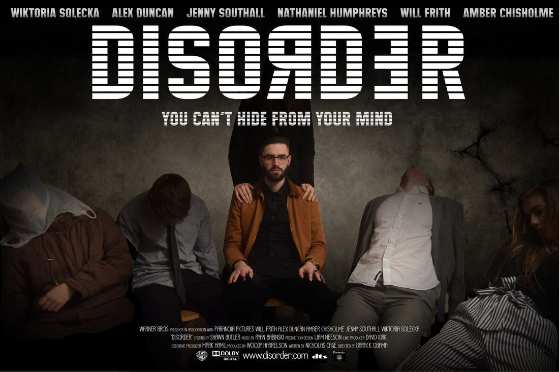
For our poster to be effective we needed several different elements to make our poster eye-catching and professional. These elements are:
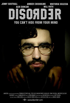
- Large and visible title - Major features/protagonist standing out - Names of the Cast - A clever Slogan - Names of production team - Links to website and other companies involved To make our poster I didn't follow a plan to create it. I used the final scene of our Trailer. However, this wasn't our original idea. Our original idea later became our magazine cover as it would fit better with that format. This poster contained everything we wanted but our Magazine required a portrait shot. This was then changed to the magazine cover as it appeared to work better. The original poster is seen to the right. |
|
|
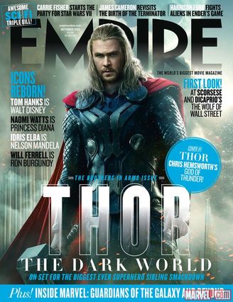
The Poster you see on the right is the final poster that we created. During the planning I found another poster which I followed the format of. This is seen on the left of which is a real poster for Thor: The Dark World.
Steps to making our Magazine Cover: 1. Plan a photoshoot 2. Complete Photoshoot 3. Find inspiration from the Internet 4. Select photo you wish to use 5. Pick a colour scheme 6. Resize the image to fit dimensions 7. Select and find a title for your magazine 8. Edit the photo (Placing head over text, darkening, lighting etc) 9. Place your title and other text to make it look interesting 10. Add a barcode obtained from the internet 11. Save and you're done |
|
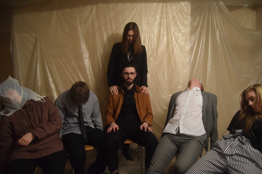
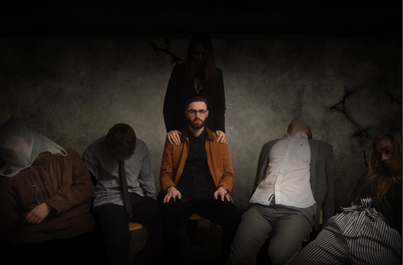
To make the poster we had to take the picture and import it into photoshop. Once imported I had to add some effects to make Nathan seem more sinister and highlight him. Our original photo needed some editing to make the poster seem more sinister and bring more focus onto Nathan. To do this I cropped out everyone in the image using the selection tool called magic wand. Once I had the people I found a background that was dark and looked like an ominous setting.
|
|
|
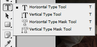
Once these changes were made I could add text to the poster. This was done through the text tool found on the left panel in Photoshop. I then used a font obtained from DaFont called Maximus BT. This font proved useful and effective as it provides a unique and memorable.
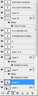
I not only had to add text for each of the different elements in the poster but I also had to highlight each person individually to make them stand out correctly against the background and the darkening effect that I added over each person. The title wasn't the only text we needed. This is where I added the credits for the poster and our names. This was attained using a font known as Universal Accreditation obtained from DaFont. This font can be seen in the image below. 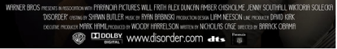
The finished product can be seen below.
|