FILM FONTS
Within our trailer, it was important that we picked the right font, in regards to the title. This was not only to allow an iconic font to be chosen but to emphasise the horror. If we had picked a comedic font then that would have lower the stature of the overall look. Below are many examples of what we tried but discontinued:
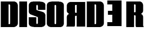
Plakette 5 SF Font:
Using this font was ideal , as it looked how we wanted it too, such as it was nice and neat, with the letters backwards making the whole thing "disordered", however we thought this font was a bit too comical for our liking, and would lower the rating of our film to make it look more "budget".
Using this font was ideal , as it looked how we wanted it too, such as it was nice and neat, with the letters backwards making the whole thing "disordered", however we thought this font was a bit too comical for our liking, and would lower the rating of our film to make it look more "budget".
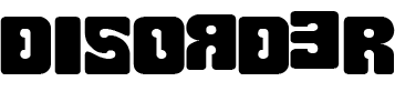
Woodchuck SF:
We were considering this due to the weirdly shaped letter, which would show the audience the weirdness of Disorders, and the mystery behind them. It symbolises most things wrong not only with the title, but how each letter is disordered.
We were considering this due to the weirdly shaped letter, which would show the audience the weirdness of Disorders, and the mystery behind them. It symbolises most things wrong not only with the title, but how each letter is disordered.
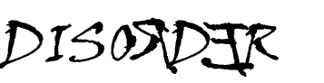
Viner Hand ITC:
We were going to heavily use this trailer font , until we found a new and improved font via people voting. This vote came short. however the font itself is a good horror font this is because the broken edges represent people who can be "broken" from a disorder, or broke n much like horror killers. If you change the font to red then it would look very much like it had been painted on, showing blood on a wall.
We were going to heavily use this trailer font , until we found a new and improved font via people voting. This vote came short. however the font itself is a good horror font this is because the broken edges represent people who can be "broken" from a disorder, or broke n much like horror killers. If you change the font to red then it would look very much like it had been painted on, showing blood on a wall.
Trailer
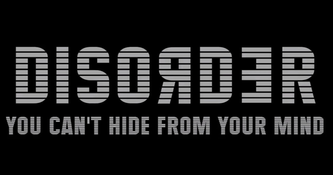
In our trailer we decided to use a simple font called "maximus BT", this was simple as it did not over complicate the idea of the film and didn't take the highlight away from the tagline. MAximus BT was a large font this meant that the audience could read it better , and because it was simple the audience would remember it creating a iconic font. We made our title white to make it stand right out from the black background, and creating more emphasis on the title itself. Having a simple font also works as you didnt have to overcomplicate any other slide within the film, as well, its not a custom made font, this meant that more time was spent on shot quality, rather than the title.
The tagline is the same font this was not only for continuity, but it made the Top title stand out a whole lot more.
The tagline is the same font this was not only for continuity, but it made the Top title stand out a whole lot more.