|
Most posters will use a condensed typeface such sans serif. Other popular movie posters have used Bee, Univers Thin Ultra Condensed, Tall Skinny Condensed and Triple Condensed Gothic.
|
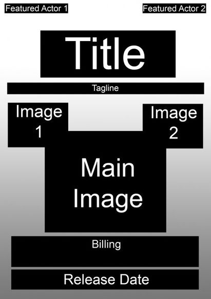
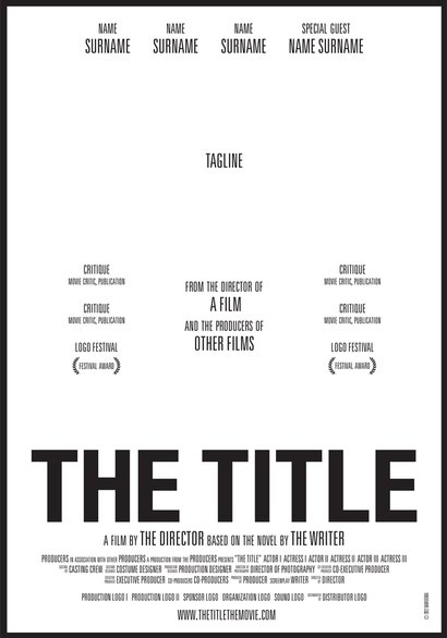
Although posters may look different, they all follow a standard layout which we need to incorporate into our own poster. The purpose of these posters is to advertise the film with both textual and graphic elements. Posters are designed to be eye-catching and informative.
There is also a less obvious format that most posters follow and that is AIDA. Standing for Attention, Interest, Desire and Action, most advertising posters will have this including many of successful movie advertising campaigns.
|
|
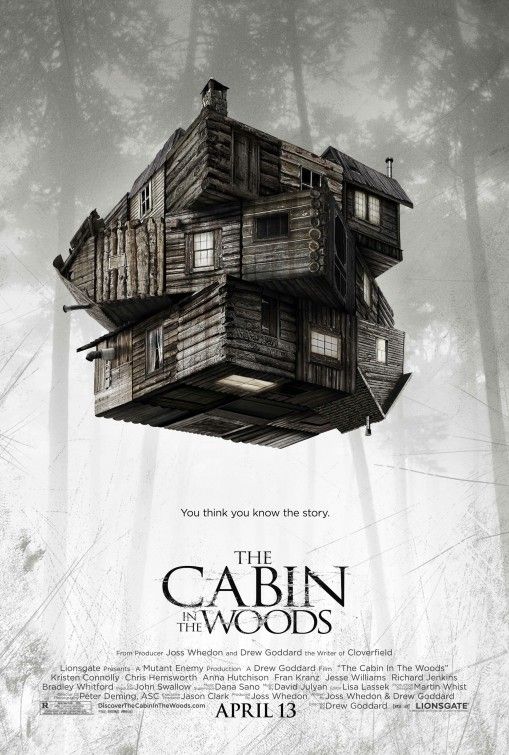
The Cabin in the Woods poster depicts the focal point to the film's plot and the white background with faint outlines of trees, contradicting horror stereotypes but effectively draws attention the cabin. The cabin is distorted and seen floating to suggest supernatural powers and mystery. This sense of obscurity is also created by the tag line, "You think you know the story." It almost coaxes viewers into wanting to watch the film. Underneath the title and before the billing it states the producer and writer of 'Cloverfield' which both assure the viewer that the film will be high quality.
|
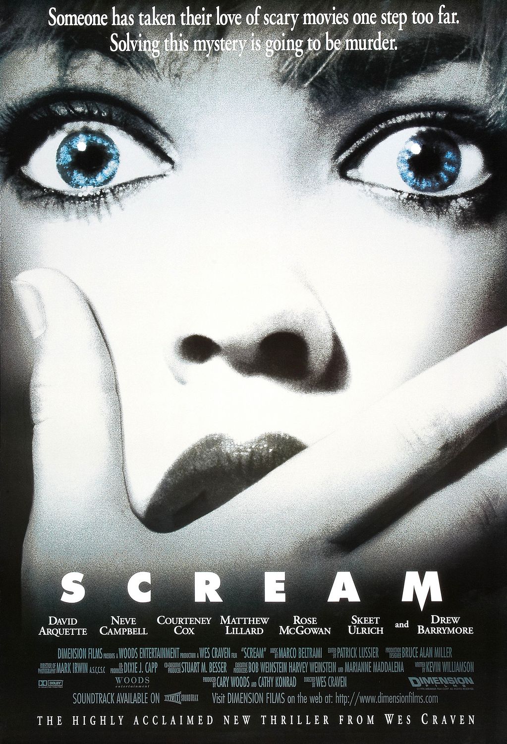
The 'Scream' poster uses shades of black, white and blue to represent the different colours of death. It draws particular attention to the victim's eyes and the mystery of what they have seen to be so terrified. The title is in a bold text, matching the simplicity of the name 'Scream'. The name of featured actors follow. This can persuade viewers to watch the film because there are recognisable actors they've seen in previous films and TV shows. It also states the director Wes Craven who is a well known horror theorist and director, highlighting the film's quality and reputation in the genre.
|
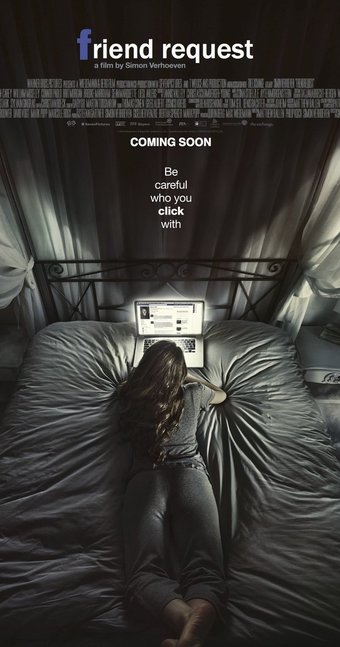
'Friend request' uses conventional black, grey and white to represent the colour of death. Even the actress is wearing all grey and blends into the background. The illumination from the laptop highlights its importance and casts shadows. The bedroom location conforms to the horror stereotype of being isolated, as the character is alone on her bed. The shadows also play on the primal fear of seeing things in the dark. By stating the director's name who is a known director in the film world, viewers can expect high quality. The tag line is bold and in contrast to the black background. There is significance to the 'click' part as it relates to the title with the recognisable facebook icon. This gives the audience an idea of what the plot of the film will revolve around.
|
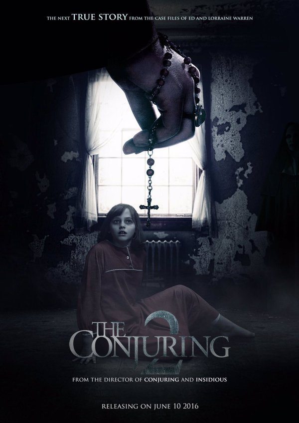
The poster for the Conjuring 2 conforms to horror stereotypes with the dilapidated background of a room in some sort of house. The girl is wearing red, a colour that symbolises danger and warning. Her face is also somewhat unnatural with pale white skin and black bags around the eyes. The use of the cross relates to the supernatural and demonic entities; it therefore highlights aspects of the plot of the film. The title is metallic and similar to the cross.
|
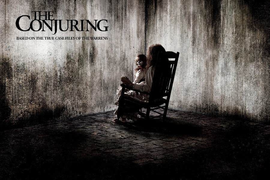
For our poster, we wanted to base the layout on the poster for The Conjuring.' The minimalist appearance is effective as you focus on the doll in the rocking chair and the text. The text is important as it is the title of the film and part of the film's identity and brand. The font of the text needs to reciprocate the branding on the magazine and in the trailer. We also need to include Nathan as his persona is a key feature in our brand identity.
